




I have always been fascinated by the art of building and creating well-functioning websites, especially online stores.
It is almost an art in itself because there is such a fine balance between fanciness and simplicity. Too much spice ruins your conversion rate, and too little makes your online store boring.
Over the past few years, I have had the privilege to collaborate with the great people from Grafikr, one of Denmark’s leading agencies in webshop development – and especially on my favorite platform, Shopify.
Therefore, I have invited Erik Holflod Jeppesen to share his insights today. He co-founded the e-commerce agency Grafikr A/S in 2016 and today, Grafikr has 20 specialists at their office in Randers, all helping shape the future of Shopify stores.
Erik Jeppesen is responsible for project management and helps the agency’s clients get the most out of their online stores. Grafikr specializes in conversion optimization and does not just deliver online stores that look “good” – they need to perform.
I asked Erik to share his 7 best tips for improving product pages. This blog post is the result, including several concrete examples.
Enjoy the read!
Optimization of your product page: 7 effective methods to increase your conversion rate
Your product page is where the majority of your customers decide whether to buy your product or leave your online store. Therefore, you must not underestimate the importance of an optimized product page.
Many online store owners focus mostly on improving their homepage, cart, landing pages, or the process after a product is added to the cart. However, most customers do not get that far unless you have a good product page, as this is where visitors click the “Add To Cart” button and are on their way to completing a purchase.
The purpose of product pages is to inform your customers why they should buy your product instead of your competitor’s. Your product page must explain what needs the product fulfills while providing customers with the information they need to decide to buy. It must be easy, inviting, and clear.
Let’s look at 7 ways you can improve your product pages to increase conversion rates:
- Don’t wait to capture interest
- Highlight a clear call to action
- Enable live chat on important pages
- Complement product images with videos
- Build trust with reviews
- Clearly present social proof and guarantees
- Focus on a suitable amount of upselling and cross-selling
1. Don’t wait to capture your visitors’ interest
In journalism, the rule is to put the best information first. Journalists start with the most important details to ensure readers don’t have to search for vital information – it is presented quickly and effectively.
You as an online stores owner can learn from this. Even if you have all necessary product details available on your page, don’t hide them in an attempt to build suspense; it only takes one click to lose a sale. You need to clearly communicate what the product is and why it has value – quickly and clearly.
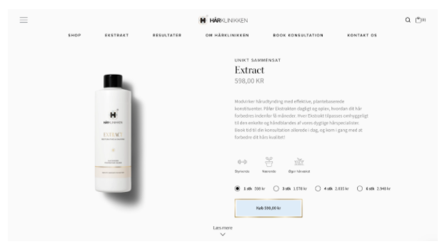
One online store conscious of this technique is one of our clients, Hårklinikken. They briefly and precisely describe the product at the top of the product page.
The key points are presented with bullet points and supporting icons. All this can be seen on a regular 13-inch screen without scrolling.
If you want to dive deeper into product details, you can scroll down to sections filled with great images and in-depth text, so potential customers aren’t left with more questions than necessary.
Remember this tip:
For most products, it’s best to start by giving your visitors a quick and clear overview. If you want to write hundreds of words about the product, hide it under tabs or sections further down the product page.
2. Highlight a clear call to action
It may sound obvious, but one thing you must never let get lost when optimizing your product pages is a clear “add to cart” button. Buying must be easy, so make this button as visible as possible as long as it does not compromise your design.
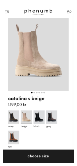
In the example above, our client Phenumb, a Danish shoe brand, succeeds with this. For the mobile-version, we made the buy button sticky, meaning it’s always visible at the bottom of the screen no matter where you are on the product page, so you can buy at any time.
3. Enable live chat on important pages
Live chat is often rated as the customer support option with the highest satisfaction; customers appreciate quick written answers, allowing them to multitask, making it the most efficient use of their time.
Live chat, like a FAQ section on your product page, makes it easy for customers to quickly get answers needed to make a well-informed purchase decision. The difference is that with live chat, they get answers as part of a conversation, either with a chatbot or a support agent.
Remember, live chat is only valuable if you have staff ready to respond promptly.
With live chat, you signal that you are accessible, creating a sense of transparency and trust. Even if customers don’t use the chat, knowing it’s available often makes them feel more comfortable.
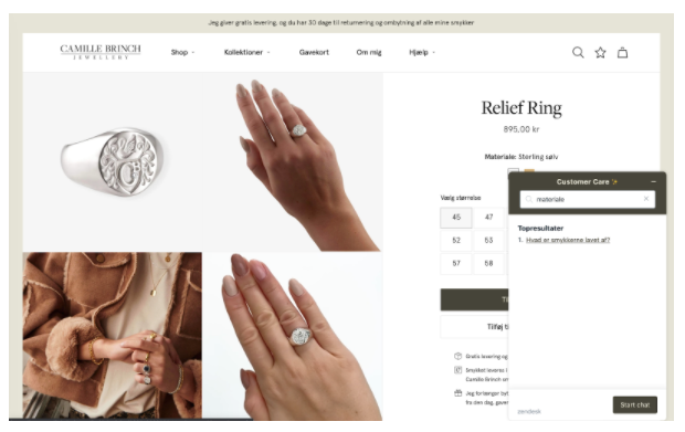
When customers do use live chat, you can address any doubts preventing them from buying. You don’t have to act like a salesperson; just be helpful and provide good service.
One online store with live chat is our client Camille Brinch Jewellery. Their chat is combined with a FAQ where you can search for answers. If you don’t find what you need, you’re encouraged to chat live with customer care.
Using a FAQ with Zendesk (the system behind live chat) reduces pressure on customer service by encouraging self-help.
Tip: On special occasions like Black Friday, consider expanding and highlighting your FAQ with relevant questions.
4. Complement your product images with videos
One of the biggest challenges in online shopping is that customers can’t physically touch or turn the product. That’s why visuals are crucial; it’s the closest customers get to seeing the product in reality.
We’ve long emphasized the importance of product images as they can be decisive for an online store’s success. However, images aren’t the only way to showcase a product visually – and it’s not just about aesthetics. Good images and videos help customers get answers to their questions, enabling better purchase decisions.

Taking Camille Brinch as an example again, they use videos on their product pages. The videos show the jewelry from all angles, filmed with slow movements, making it easy on the eyes and naturally integrated with other page elements. Videos better convey size, details, and materials as light reflects from different angles.
Videos don’t have to be long or complicated – keep it simple.
Think about what a customer would want to see closely if they were in a physical store. Focus on details, components, and features your customers care about, and use visuals to bridge the distance often felt in online shopping.
5. Build trust with reviews
The more a product aims to deliver a specific positive result, the more important it is to have customers share their experiences – ideally through reviews.
Almost 95% of buyers read product reviews before purchasing, and studies consistently show that customers trust reviews more than the online store itself.

Since customer reviews are so common, consider ways to attract attention to them or add to the social proof reviews already provide.
As mentioned earlier, Hårklinikken is good at gathering reviews and even receives photos from customers showing product results.
User-generated content, especially photos, builds tremendous trust. If you run a Shopify store, the Shopify App Store offers many apps to collect reviews, such as “Yotpo.”
Bonus tip: Follow up with customers a few weeks after purchase and ask for an honest review. This can be automated through services like TrustPilot. You can also encourage customers to share their latest purchase on Instagram and tag your profile.
“Almost 95% of customers read reviews before buying, making reviews essential for building trust.”
6. Highlight certificates and guarantees
If your product has quality stamps from industry experts or recognized certifications, highlight them on your product page to build trust.
Any certification showing you sell a quality product should be included on your product page. Instead of just writing it in the description, badges and certificates save space and attract attention, especially if the icons are widely recognized.
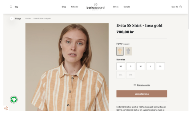
Basic Apparel clearly shows their GOTS certification as a sticky icon on the left side. The GOTS certificate is proof of sustainable production and has strict requirements, making it a true quality mark.
These badges reduce customer concerns. For example, a gluten-allergic customer can quickly spot a “gluten-free” label.
Be aware that you need permission to use official certificates and marks on your online store.
If you don’t refer to official organizations, such as E-mærket or the Nordic Swan Ecolabel, consider creating your own badges to quickly communicate important product information.
Examples include “Produced in Denmark” or “Sustainable production” – these usually work better as designed badges than just text in the description.
Another way to reassure customers is by offering guarantees. Instead of putting this info on a separate page, clearly state satisfaction guarantees on the product page, so customers see they can return products if expectations aren’t met.
7. Focus on a suitable amount of upselling and cross-selling
The goal of a product page is to sell. However, many online stores lose buyers by overcrowding product pages with too many extra offers and links to related products. It must not feel like a cluttered mess.
Used properly, upselling and cross-selling can increase average order value.
Linking the product a customer is viewing to other complementary products creates a sense of completeness and can even make the original product more appealing.
Tip: Tools like Clerk.io help show related products using AI to ensure relevance.
Alternatively, develop a “shop the look” feature showing other items the model is wearing.
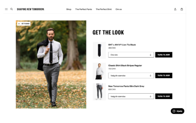
“Shop the look” can be done in many ways. At Shaping New Tomorrow, it’s created as a whole universe where you browse outfits for inspiration.
Create product pages that sell
If your product pages are poorly presented or unstructured, you risk frustrating customers and losing significant revenue. Monitor your conversion rate and do everything possible to improve it so more visitors become paying customers.
Going the extra mile to create product pages that stand out by being both beautiful and functional – but most importantly, converting – can do wonders for your business.
The more effort you put into your product pages, the more your customers will be interested not only in the individual product but also your brand as a whole. Remember, it’s a process and not something you fix overnight.
Sometimes small changes can have the greatest impact on your conversion rate and business. Start with clear ideas to improve your product pages and implement them – you should soon see a difference.
FAQ: Conversion Rate Optimization
How do I find out why my e-commerce store has a low conversion rate before making changes?
You need to start by diving into your data instead of relying on guesswork.
Tools like Google Analytics can show you exactly where in the funnel your customers are dropping off, while heatmap tools like Hotjar or Clarity reveal how they actually interact with your product pages.
It is all about combining hard data with visual user behavior so you can spot the technical bugs or design barriers frustrating your visitors.
Only when you truly understand the core problem does it make sense to tweak your elements and optimize.
What is a good conversion rate for a Shopify store, and when should I start optimizing?
An average e-commerce conversion rate typically hovers between 1% and 3%, but this depends entirely on your specific industry and product price points.
However, you should never blindly obsess over other brands’ numbers; your most important benchmark will always be your own historical data.
If your store has stable traffic but your conversion rate sits below 1%, it is a clear sign that there is friction throughout the user journey.
Optimization is a continuous process, and you should always focus your efforts where you find the highest potential to impact your bottom line.
How does website speed affect conversion rates?
Site speed is absolutely everything because today’s online consumers have significantly less patience than ever before.
If your product page takes more than a couple of seconds to load, the customer has already bounced to a competitor before your images even render.
You can boost your speed tremendously by compressing heavy product images, cleaning out old Shopify apps, and eliminating bloated, unnecessary scripts.
A fast online store creates a streamlined, effortless user experience, and you will see that impact reflect directly in your conversion rates.
How do I optimize my e-commerce site for mobile conversions?
Mobile optimization is not just about scaling your desktop layout down to a smaller screen; it is about adopting a strict mobile-first mindset.
Everything from your navigation menu to your primary “Add to Cart” button needs to be placed strategically so it is easily reachable with a single thumb.
Keep your copy short, punchy, and scannable, and ensure that intrusive pop-ups do not block the actual purchasing path.
A truly mobile-friendly online store is fast, clean, and stripped of unnecessary clutter, making the entire buying process feel second nature.
What triggers can I use on my product pages to drive sales?
You can create natural momentum by leveraging subtle triggers like urgency and scarcity on your product pages.
This could be a low-profile text banner showing “only a few pieces left in stock” or a countdown timer for same-day shipping cutoffs.
The goal is never to stress the customer unnecessarily, but rather to eliminate the final hesitation for a visitor who is already on the fence.
When you combine these gentle nudges with clear value propositions, you drastically shorten the customer’s decision-making process.
What are the biggest conversion rate optimization mistakes e-commerce brands make?
The biggest pitfall is trying to change too much at once, which often leaves the online store overcrowded with flashing elements, pop-ups, and disorganized content.
This creates massive overload and confusion, ultimately driving customers away instead of guiding them smoothly toward the checkout.
Another classic trap is blindly copying a competitor’s design solutions without testing whether they actually resonate with your own unique target audience.
Successful CRO is all about balance: keep the interface simple, maintain an easy overview, and let data dictate your visual choices.
How do I design a high-converting checkout process to reduce cart abandonment?
Your checkout flow must be completely friction-free so customers can complete their orders without a single second thought.
Allow users to purchase as guests without forcing them to create an account and keep your form fields strictly to a bare minimum.
This is where express payment gateways like Apple Pay, and Google Pay make a massive difference by auto-filling details with a single click.
The fewer steps and decisions your customer has to face at the finish line, the fewer opportunities they have to abandon their cart.
What payment methods and shipping options should I offer to improve conversions?
You need to offer the exact payment and delivery solutions your customers already know, trust, and use in their everyday lives.
Integrating popular credit cards alongside modern digital wallets is essential, while providing flexible shipping alternatives like local pickup or express delivery is a must.
If a customer reaches the final step only to find their preferred shipping or payment method missing, they will bounce immediately.
Keep your options flexible and your pricing fully transparent so no unexpected costs pop up at the last second.
How do I start A/B testing on my online store, and what elements should I test first?
A/B testing involves showing two different versions of a webpage to your visitors to see which variation drives the highest conversion rate.
You should always start by testing high-impact elements that directly influence the buying decision, such as the color, copy, and placement of your main CTA button or your headline.
Utilize user-friendly testing tools that integrate seamlessly with your e-commerce platform and let your experiments run long enough to gather data.
This ensures your design decisions are always backed by real user behavior rather than a gut feeling.
How can I use personalization and AI to increase my average order value?
By leveraging smart AI algorithms, you can display tailored product recommendations that directly relate to what your customer is browsing in real time.
If a shopper adds a pair of shoes to their cart, the system should automatically suggest matching socks or the correct leather care kit right on the page.
It is all about creating a highly relevant, personalized shopping experience that feels like premium customer service rather than an aggressive upsell.
When your timing and product relevance align perfectly, your average order value will naturally scale upward.






Comments